| 1. Vibrant Pop up Links |
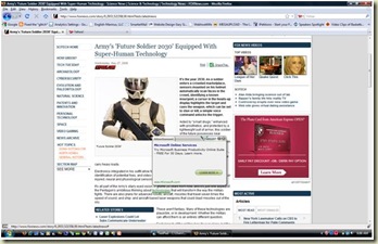
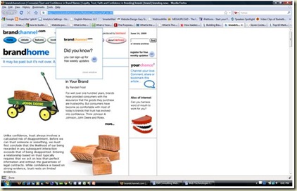
| What is it – Pop up box generated by mousing over key words in content areas. Usually represented by double or single dashed underlines meant to draw the user attention to key word. |
| Where it came from - OK I understand the concept of this technology. Some marketing executive sitting on an airplane toilet reading an article about per click revenue got an idea. It went something like this “Hey I know, we can scan keyword in a web page that will pop-up a box to drive per-click revenue.” Next things you know, the software guys are in the back room with pitch forks in hand and Malakoff cocktail at the ready. They’re on the prowl for anyone that even looks like a marketing type. After cooler heads prevail, like Houdini appearing out of thin air, “PURE FRUSTRATION IS BORN” in the form of this “STUPID” little widget.
How the user see it – Simply stupid, like we’re not inundated with enough advertisements. Now our precious 48 seconds scanning an article has been simply ruined. As if there isn’t enough cunning ways to get clicks. Like I say this technology is simply “STUPID”. |
 |
| 2. Yahoo Mail and Weather Expanders |
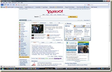
| What is it – A sliding panel that shifts either up or down or left to right exposing our intimate email details or weather or whatever else they can come up with. |
| Where it came from – Real estate is valuable, even in the virtual world. In an effort to conserve on real estate thus “be frugal”. Yet, frugal to the point that user will be driven batty by features. The funny thing, the problem is not with the widget but how it’s implemented. Mousing over scrolling text and pictures are just simply annoying and confuse the heck out of users. It’s like sitting on a whoopee cushion, “wow, what was that”.
How the users see it – This is what I call, “what the hell, I didn’t ask for that”. Simple, I appreciate the weather “cool” but I don’t want the details. Kill the details, I know it hot, I live in Texas. Oh by the way, I’ll pick up my mail when I’m good and ready too. Thanks, but no thanks. |
 |
| 3. Skip this Ad |
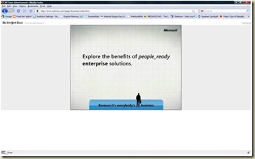
| What is it – When the user clicks a link to a follow on page, instead of delivering the content; Straight out machine gun Kelly pop in a cap! 187, another advertiser on user drive-by |
| Where it came from – The devil, honest, it came from Satan himself. All you marketing types, I’m going to give you a break because I know, I know – “the devil made you do it”. I pour a little liquor on the curb to all my information architect types that took to the noose over this one - RIP.
How the users see it – It spun from hell itself, how else are users suppose to see it. I click a link, promising “MY” content; instead some weird page having absolutely nothing to do with what I just requested is displayed. I know – “the devil made you do it”. |
 |
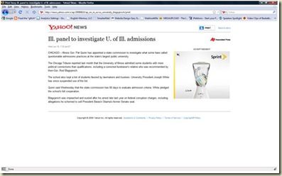
| 4. Who wrote the article |
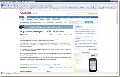
| What is it – Ok strictly speaking this is not a technology, just a pet peeve of mine, but it’s on the web so I threw it in. Its content from a website without an author indicated and/or cited reference. I did not know Associated Press was an author. |
| Where it came from – This is just sneaky. You’re reading a news article online, like most articles advocacy reporting is the new trend in news agencies. Ok, so who actually wrote the article, no writer or sources are cited. In other words who wrote this article? I thought it was standard practice that the writers identify themselves.
How the users see it – This under handedness just continues to build distrust of the news. Hey, most news agencies are hurting for cash, right. So if they deliver content which annoy the customer base then the customer won’t find value in the news, so less revenue….. “Just thinking off the top of my head here” |
 |
| 5. Webpages that auto play media |
| What is it – The user opens up a page then streaming media immediately starts in on them. |
| Where it came from – The porn industry and teenagers, then adopted by main stream media sources. User experience people would never, in a million years recommend, “when a user opens a web page it starts blaring streaming media” of any type, unless of course it’s for personal pleasure.
How the users see it – Damn, my boss just caught me surfing the net again or “Hey, that’s not suppose to show on my screen.” |
 |
| 6. Animated advertisements on print pages |
| What is it – Web pollution: the introduction of valueless items to a page that causes irritation, disorder and annoyance to the user. |
| Where it came from – I have no idea how this bright idea got implemented.
How the users see it - “What the hell! Really, animated advertisements on a print page. What is this -- The Harry Potter newspaper. Great, so now my article is 13 pages of junk instead of the 2 pages I really need.” |
 |
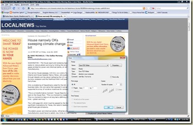
| 7. Print Dialog without the print page |
| What is it – The user presses the print link, instead of clean content, just the print dialog is displayed. |
| Where it came from – Lazy content administrators not removing the graphics and other pollution providing clean, clear print pages.
How the users see it – This sucks….. |
 |
| 8. Screen Flashers and Streakers |
| What is it – The user gets bombarded with flying dialog boxes demanding stuff. |
| Where it came from – Marketing departments once again hunting for clicks to justify themselves. Usually about this time, user experienced professionals are sitting at their desks drunk and spilling their guts about how their life sucks.
How the users see it – “Hey, whoa, wait a minute, I didn’t expect that is all I’m saying. We just got to know each other. I mean, I just got to your site and now you’re flashing me with Chevy Cobalt ads all over the screen. Hell, I don’t know you like that!” Or “Oh, damn so soon, I mean you’re just streaking across my screen asking me to register or for a survey. Can I at least get a name and a phone number?”Yeah, that’s what it feels like - a bad date….. |
  |
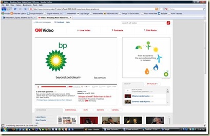
| 9. Paid advertisement in videos |
| What is it – The user clicks a link expecting a streaming video – Bam! Advertisement up the wazzu… |
| Where it came from – The same promise that cable was suppose to deliver. You pay for the service and you get no commercials. Except now it’s free, so companies are like – “kiss our ass, you’re going to see it”.
How the users see it – SOB, I just cannot get away from these stupid advertisements. |
 |
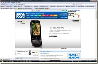
| 10. Information Overload |
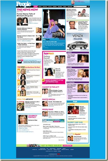
| What is it – Global website warming, content pollution, information dumping – just too much content to absorb… |
| Where it came from – The U.S. Tax Code and China… Two schools of thought here -- overload them for more effective confusion; and with one billion people and limited real estate, pack everything you can into as much space as possible. Even for information architects there are limits to their abilities.
How the users see it – Ahhhhh…. Muhhhhh…..Ahhhhh….. |
 |
